Grout is one of those things you don’t think about until you’re standing in the tile aisle with a toddler hanging off the cart. I learned this the hard way during our primary bath and kitchen projects. I bought samples of three different colors, mixed up test batches, and lived with them on actual tile for weeks before deciding. The winner? The one nobody notices. This is the full story of why that boring choice was the right one for our 1977 Colonial with two sticky-handed kids.
Why Grout Color Matters More Than You Think
Most people pick grout as an afterthought — “just match the tile.” I almost did that too. But after seeing how much the lines stand out (or disappear) once installed, I decided to test properly. Grout color affects how clean the space looks, how much maintenance it needs, and how the whole room feels over time.
In a house with Leo racing toy cars across the floor and June splashing in the tub, durability and forgiveness were non-negotiable.
Not everything needs to cost more. Some things just need to be thought about more — and grout is the perfect example of a tiny decision with daily impact.
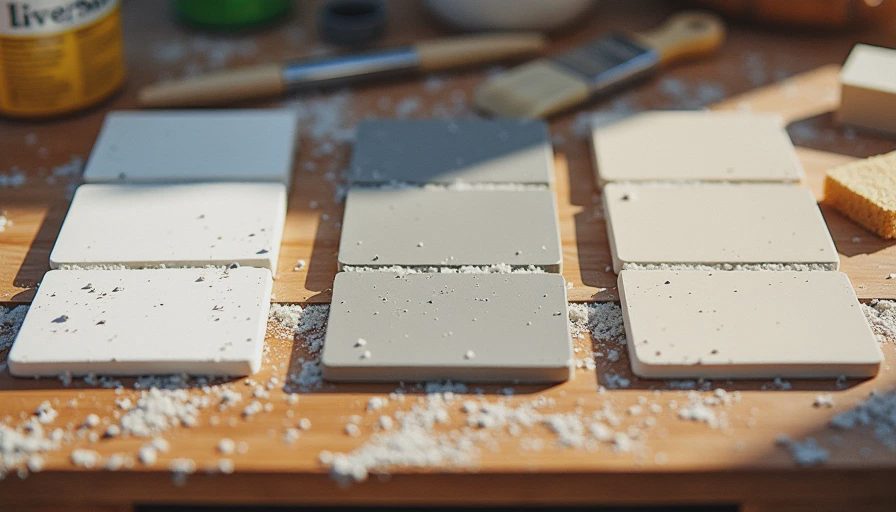
The Three Contenders — Side by Side Testing
I bought small tubes of premixed grout and made test patches on spare tile pieces, then installed them temporarily in high-traffic spots.
Option 1: Bright White
This was the trendy choice. It made the subway tile pop and looked super clean in photos. But in real life? Every speck of dirt showed immediately. After two weeks of normal family use, the white lines looked gray and tired. Cleaning took forever with a toothbrush.
Option 2: Light Gray
A safe middle ground. It hid some dirt better than white and still gave contrast. But in our warm white painted rooms, the gray created a slightly cold, industrial feel that didn’t match the rest of the house. It also highlighted every imperfection in my tile spacing.
Option 3: Soft Beige / Light Taupe
This one barely registered at first. It blended with the tile edges and the overall warm neutral palette. After a month of testing, it still looked fresh with minimal effort. Fingerprints, soap scum, and toddler splashes disappeared into the lines instead of shouting for attention.
The Decision Process and Final Choice
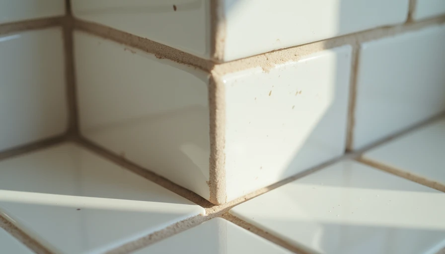
I lived with all three samples for over a month — through multiple baths, kitchen cleanups, and even a spilled juice incident. The beige won by a mile. It makes the tile look more like a cohesive surface rather than a grid of lines. In our bright, warm rooms it disappears in the best way possible.
We used a sanded grout in that soft beige tone for both the bath and kitchen. Installation was straightforward once the color was chosen.
Budget Breakdown: Cheap Experiment, Big Payoff
Three sample grout tubes: $18
Spare tile pieces for testing: $0 (leftover from previous orders)
Full project grout (bath + kitchen): $95
Extra cleaning supplies during testing: $12 Total experiment cost: ~$125
Way cheaper than regretting the installed grout and having to live with it (or worse, re-grout later).
What I’d Do Differently Next Time
Test even earlier — right after choosing tile but before ordering.
Make larger test patches (at least 2 sq ft) and install them vertically and horizontally.
Factor in lighting. What looks good under showroom lights can change dramatically in your actual rooms.
Keep a small container of the final mix for future touch-ups — we’ve already used it twice.
How It Looks and Feels After Living With It
Nine months post-install in the bath and longer in the kitchen, the soft beige grout still looks clean and intentional. It doesn’t fight with the tile or the warm white walls. Daily cleaning is simple wipe-downs instead of deep scrubbing sessions. The rooms feel calm and cohesive rather than busy.
Guests don’t notice the grout specifically — which is exactly the point. They just say the spaces feel “nice” and “put together.”
Lessons for Your Own Tile Projects
If you’re about to pick grout color:
Never choose in the store alone. Bring samples home and test under your lighting with your actual tile.
Think about maintenance. Darker grouts hide dirt but can look dated; lighter ones show everything.
Match the overall vibe. In family homes with warm neutrals, a soft beige or taupe often wins for longevity.
Sand vs unsanded. Use sanded for floor and shower walls (stronger); unsanded for small vertical details.
Seal it. Even the best color benefits from a good sealer, especially with kids.
This project perfectly fits The Detail category — those small choices that separate “looks fine” from “feels really good to live in.”
Grout taught me patience and the value of real-world testing. The “invisible” choice ended up being the most visible improvement in how the spaces function day after day.
If you’re mid-tile project and staring at grout color swatches, take the time to test. Your future self (and your cleaning supplies) will thank you.
Next in The Detail I’ll share more about the bathroom vanity we originally bought wrong and how we made it work. Until then, go mix up a few test patches. The extra hour now saves months of mild annoyance later.
— Ethan

No letters yet — be the first to write.